Teaching with Code
Clean code protocols exist to encourage code that is human-readable, maintainable and permit team collaboration instead of code that merely communicates to a computer. We do not build software in isolation, and people often forget how their code works a week after writing it.
But code readability standards all assume a uniform audience, which is not the case in our work.
We need to write one type of code when writing to our peers, and another type of code when writing to beginners.

A teaching regime holds whenever clarity and communication outway performance and features.
In fact, in this regime, performance and features hinder effective clarity and communication.
Simplify
Determine the simplest wording to achieve your aims. Not shortest, not the most elegant, and not necessarily most efficient.
Simplest.
Simple code is also not the same as prototype code.

Let’s compare a program to a path through unknown territory. Prototype code would twist and turn, often splitting off into dead ends. Only after an explorer knows the terrain can they fill in the swamps, level the mountains, and take a straight path from A to B. To someone else, this path looks simple and easy, but a massive effort went into creating the path.
Get your code to work.
Then write it again.
Then write it again.
And again.
During this process don’t add features and don’t try to make the code run faster. You’re not building a rocket ship. Focus on making the code speak, just as if you were explaining the algorithm aloud or writing pseudocode down on paper.
Explain like you’re talking to Grandma

Some might know the difference between a GPU and CPU, but some might not. In my experience, looking up an unknown term is similar to giving a mouse a cookie. I’m going to want a cup of milk to go along with it. A few hours and a hundred tabs later, I’ve learned a lot of interesting things, but I rarely get back to what I was originally doing.
If you are using a technical word in a document, first ask if you need to use it. If you do need to use the word, define it. No one will think less of you for defining a term. Your audience might be impressed if you present a nice way of thinking about a tricky subject.
Even when I assume a particular audience, say physics students, I like to explain the concepts in terms of everyday activities as well.
Separate Tutorials and Documentation
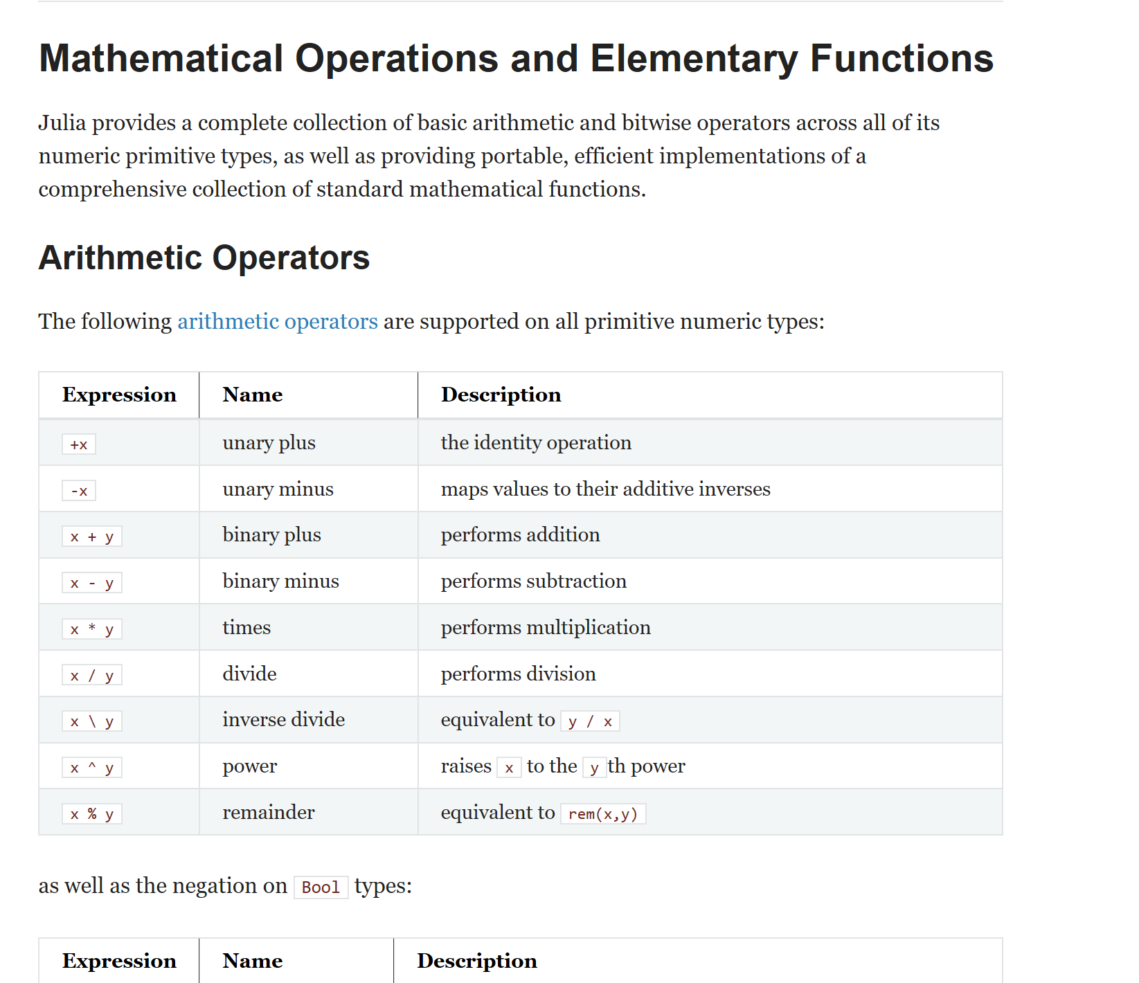
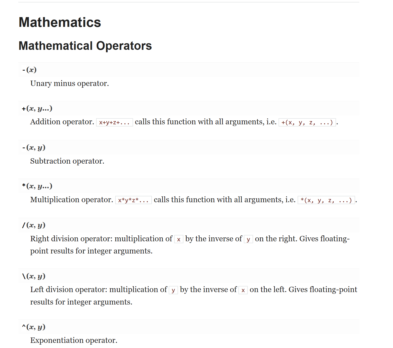
Both are necessary, but they serve distinctly different purposes.
Users visit tutorials to find just what they need to get up and going quickly. These should be the easiest pages to access. The priority is efficiency.
Developers use documentation to keep the project consistent, and users visit documentation to solve finicky issues. The priority here is to be comprehensive.
If you want anyone else to use your product, write both. Don’t try and pass off one as the other. I think at one time or another most of us have probably had to either learn something new from either 100 pages of technical jargon or do original research after a 10-minute walk through. I don’t want to name names, but I don’t have particularly fond feelings for either FFTW or COMSOL.
Concepts versus Details

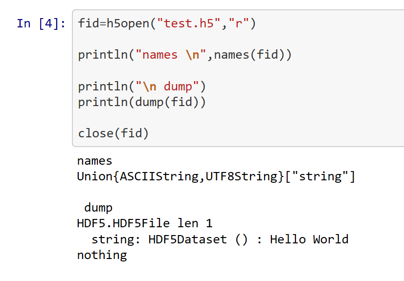
You can’t see the forest through the trees. Either go to a mountain top to look at the whole valley or look at an individual tree.
I don’t want my reader pondering over the meaning of a && symbol while I’m trying to explain conserved quantities and Noether’s theorem, but I also don’t them to be pondering over the nature of quantum spin while I’m trying to teach how XOR works.
In my experience, when I’m trying to juggle too many new things at once, I just get overwhelmed and don’t learn anything at all.
Check Spelling and Grammar
Check
- With a Computer
- By reading aloud
- By another person
I recommend Grammarly for automated spelling and grammar check.
I feel silly harping on this because I have horrible grammar. I might know exactly how to use a comma in Julia, but I have no idea how to use it in English. But whenever a mistake exists in the sentence, whether anyone realizes it or not, the brain has it’s expectations refuted and has to do a little more work to figure out what is going on. I would prefer the reader’s brain to spend its time pondering the significance of symmetry breaking instead of whether or not I meant to put a comma in that sentence.
Grammar goes beyond just those rules you learned in elementary school to elements of style and flow. That’s why I recommend reading your writing aloud and having someone else read your work.
1. Avoid passive sentences
Historical norms say to avoid using the first person in formal writing, but I have no problem with the first person and do have a problem with passive. Active sentences liven up your writing.
2. Change up your vocab
While in technical fields, we have many specific words that we can’t replace with synonyms, in other situations, a thesaurus can help writing from getting repetitive and clunky. If only Grammarly stopped complaining when I use “Hamiltonian” for the 50th time.
3. Avoid unclear antecedents
I didn’t know what an antecedent was before Grammarly kept correcting me on it. In the first example sentence, the pronoun “he” was unclear.
Be wary of the word this. People use the word “this” but leave unclear what the word “this” refers to.
4. Remove filler words and wordy phrasings
Rule of Thumb: If you can remove a word from a sentence, and the meaning of the sentence doesn’t change, remove the word.
Let the design do the reader’s work for them.
People are lazy. Or busy. Or busy and lazy. You cannot expect them to sit down and spend an hour reading over everything in your documentation to find what they need, or to determine whether or not they want to use your package.
They have deadlines too. And lunch hour soon. And a movie playing in the corner of their screen.
Make your page in such a way that people can glance at the screen and determine which information is important by
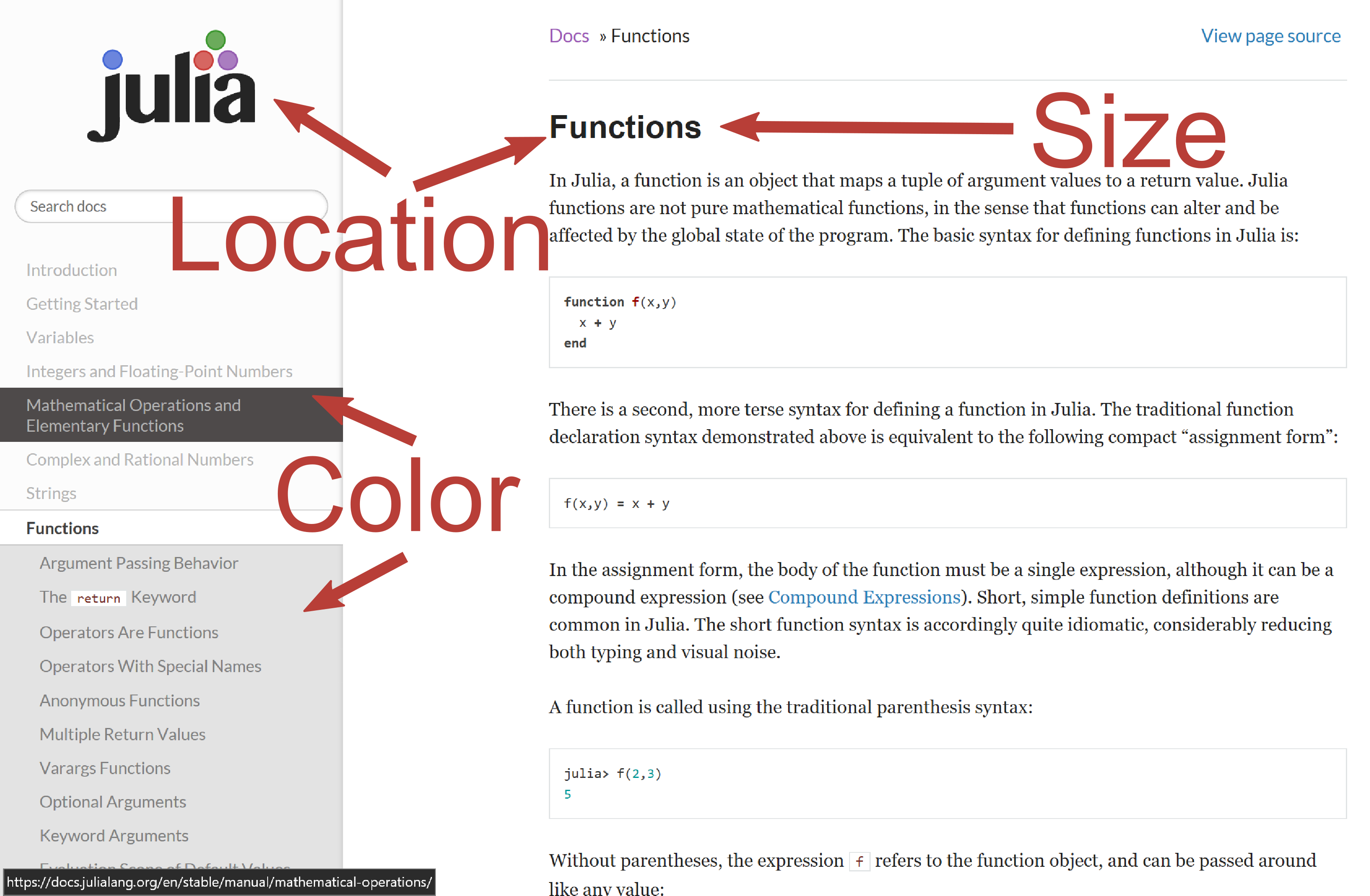
- how large it is
- how it’s colored
- where it’s placed
Once the brain knows where to look, the page needs to keep them around and relaxed.
- Color scheme
- Font
- Density
- Busyness
all play into whether a page relaxes or stresses someone.
A few simple changes can make a huge difference. I took the worst site out there, FFTW, and manipulated its HTML. The original page is the far left image below. Next, I just eliminated the underline. After that, I altered the font to “Helvetica Neue” and highlighted the section heads. Finally, I changed the color palette. I never touched the content, but the page moved from terrifying to something readable.
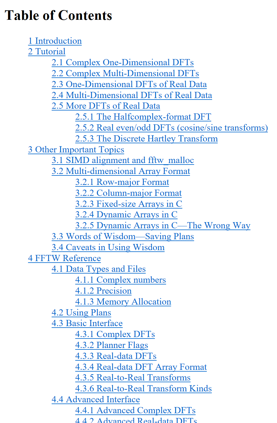
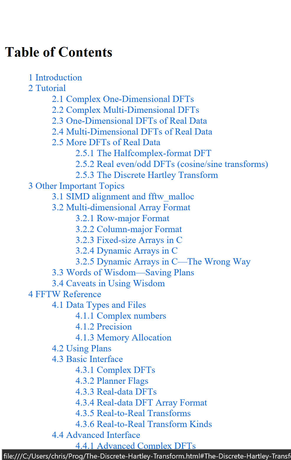
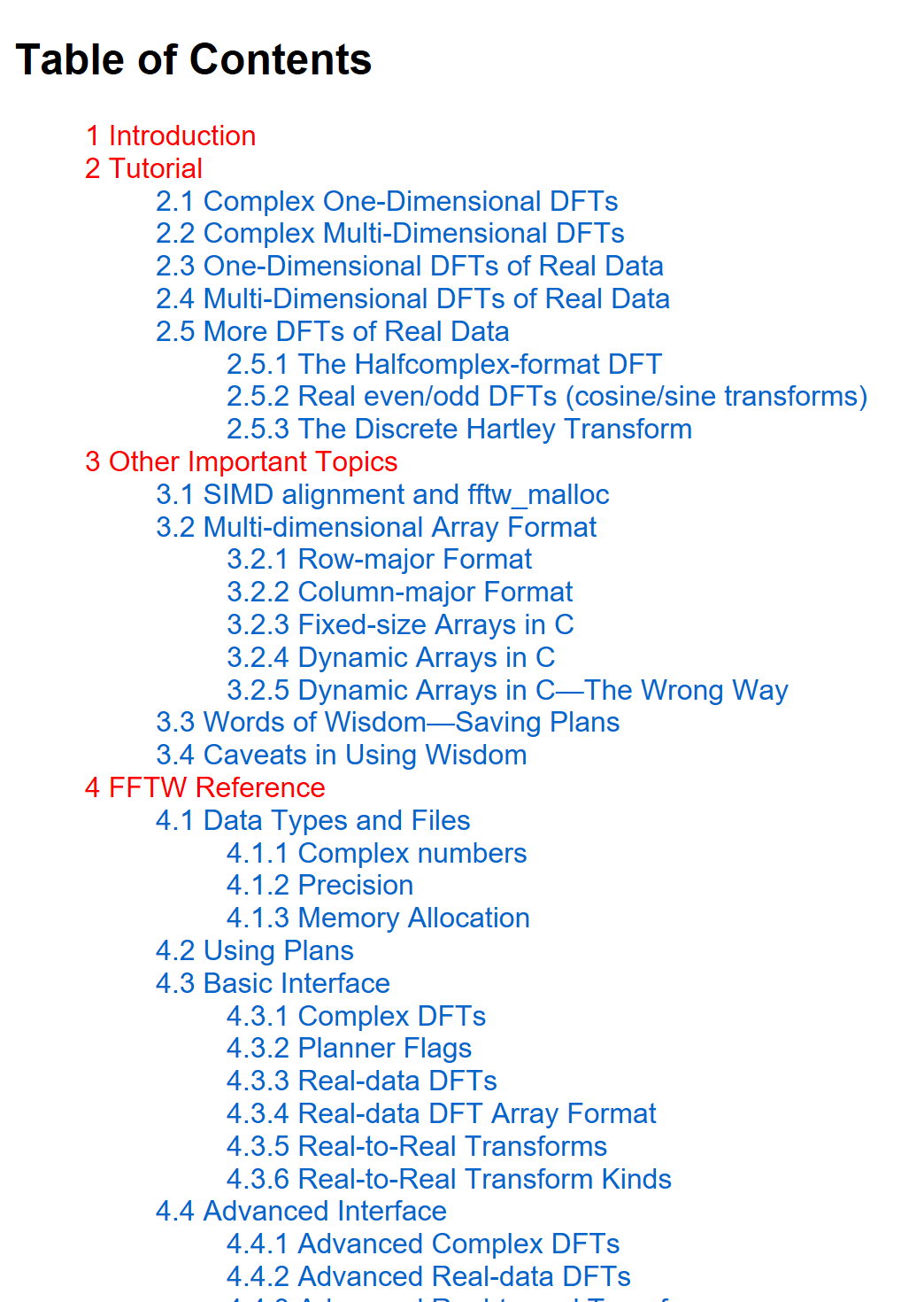
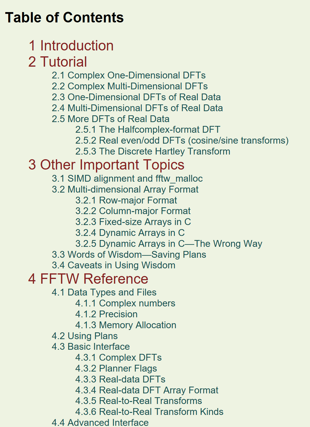
I recommend Paletton for creating a color scheme. The website generates a palette according to rules of color theory, eliminating the wishy-washyness of someone untrained in design judging based on personal taste.
Sans-serif scripts work best for screens and presentations, but serif characters work best for printed works. Arial or Helvetica fonts are clear and readable. You can’t really go wrong with these choices.
Whenever I make something for public consumption, I ask
- Does the design reflect the information?
- Does the brain know where to look?
- Does my brain tense up or relax when I look at this?
Conclusion
These concepts seem fairly straight forward, but good documentation and tutorials take a massive amount of work. To have good communication, we as a community need to place a priority on good tutorials, documentation, and communication.
The best package in the world means nothing if no one is able to use it.